
Grey bedroom ideas range from a sixty-dollar DIY panel wall to a $2,800 upholstered headboard, and the deciding factor is not budget but how much of the work you are willing to do yourself. The cheapest option in this list, primed MDF baseboard ripped to three-inch strips and brad-nailed into a grid, took one afternoon and outlasted the velvet euro sham that spent two years collecting cat hair.
1. Elegant Framed Panels
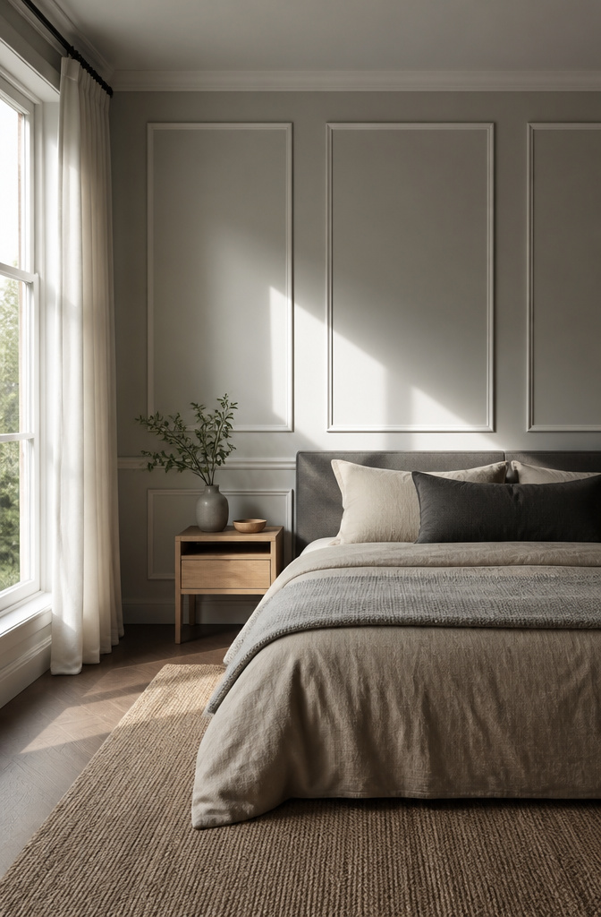
Wall panels with trim molding turn a flat grey wall into something that reads as architecture rather than paint. I built mine around a warm grey, Farrow & Ball’s Cornforth White No. 228, which sits right in that space between greige and true grey so it doesn’t go cold under artificial light.
The measuring took longer than the cutting. I sketched the wall first, then laid out the panel grid on the floor with painter’s tape until the spacing felt even. The shadows between panels matter more than the grey itself; too tight and the wall looks busy, too wide and you lose the depth. Mine sit about three feet apart, which at eye level gives you a clear rectangle of shadow that shifts through the day.
I used primed MDF baseboard for the molding, ripped down to three-inch strips on a table saw. The material ran about a dollar a linear foot at the big-box store, so the whole bedroom wall came in under sixty dollars before paint. Installation was a brad nailer and construction adhesive; the trick is getting the first frame level, because every other panel squares off that one. I spent an afternoon on it, painted the next morning, and the wall looked finished by dinner.

Transformative - Art3d pre-cut molding trim adds depth and character to walls, gives traditional elegance with a hint of contemporary refinement

Transformative - Art3d pre-cut molding trim adds depth and character to walls, gives traditional elegance with a hint of contemporary refinement

Create Artistic Accent Wall: This peel and stick wall molding adds layers and artistic flair to ordinary walls, instantly elevating the design aesthetic of your home decor. It easily complements wall borders, paneling, accent walls, and other decorative applications, beautifying your space
2. Cozy Leather Accents
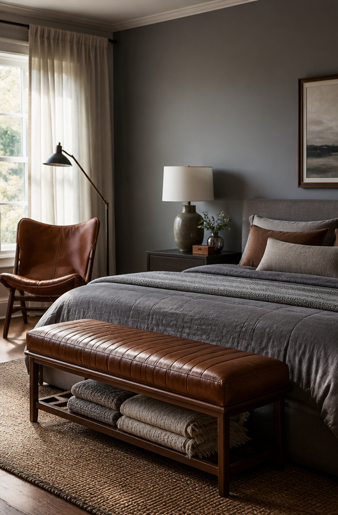
Grey walls can read flat until something warm breaks them up. A bench in cognac leather at the foot of the bed does this without adding another color to manage. I bought Article’s Sven bench in Charme Chocolat for $699 two years ago, and the leather darkened from a medium caramel to a deep tobacco within six months of morning sun through east-facing windows. The change was even, so it looks intentional, but buy lighter than you want if the piece sits in direct light.
One accent chair in the same leather family, placed where a reading lamp already lives, keeps the warmth from feeling like a set. I found a vintage-look saddle chair on Facebook Marketplace for $180 and conditioned it with the same Obenauf’s oil to keep the tones speaking to each other. Two leather pieces max in a grey room; anything more starts to look like a law office. The bench stores extra blankets underneath, which matters more than I expected in a room with no closet expansion planned.
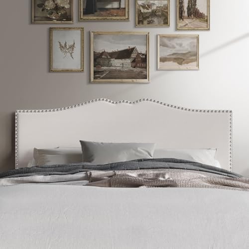
Adjustable height allows the headboard to fit your preferred setup perfectly.

Button-Tufted Design elegant tufting adds texture and a timeless touch.

Adjustable height allows the headboard to align perfectly with your preferred setup.
3. Industrial Wool Flannel
Wool flannel on a bedroom wall reads expensive the second you touch it. The Zoffany wallcovering I sampled was the real thing, heavy enough to deaden sound and warm enough to make painted drywall feel like a refrigerator. The installer quoted roughly what I had budgeted for the whole room, so I declined and looked for the tactile quality another way.
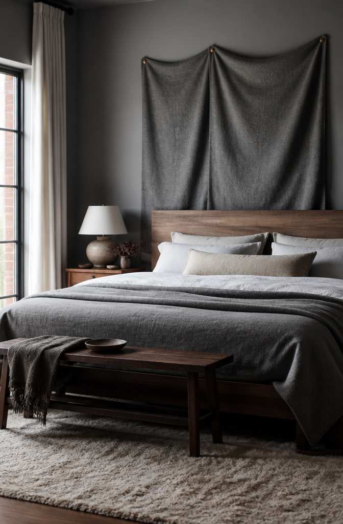
Two thick wool blankets in a heathered grey, stretched across the wall behind my headboard and tacked with brass nails, gave me almost the same effect. The blankets cost a fraction of the wallcovering install, and the brass heads read as deliberate against the soft nap rather than hardware-store afterthought. Leave a little slack when you stretch them; the slight give is what makes the wall feel upholstered instead of pinned flat.

This bench is large, stable, sturdy, and classic, measuring 47.5"W x 17.7"D x 17.7"H, making it easy to move around. Its classic and elegant design complements various home decor styles, and it's also easy to clean. Craftsman-built frames are constructed using solid, reinforced, laminate hardwood for lasting strength and superior stability.

BENCH WITH STORAGE: HomePop modern storage bench is a versatile and stylish furniture piece that serves multiple purposes. With dimensions of 60 inches wide x 18 inches deep x 21 inches high, it provides ample storage space while adding a contemporary touch to your home

Basic parameters: Overall: 13.8 "D x 43.3" W x 17.8 "H; Seat height: 17.8" H; Storage capacity 32L; Maximum load capacity of 500LBS; with flipping cover;
4. Muted Colors With Teal Pops
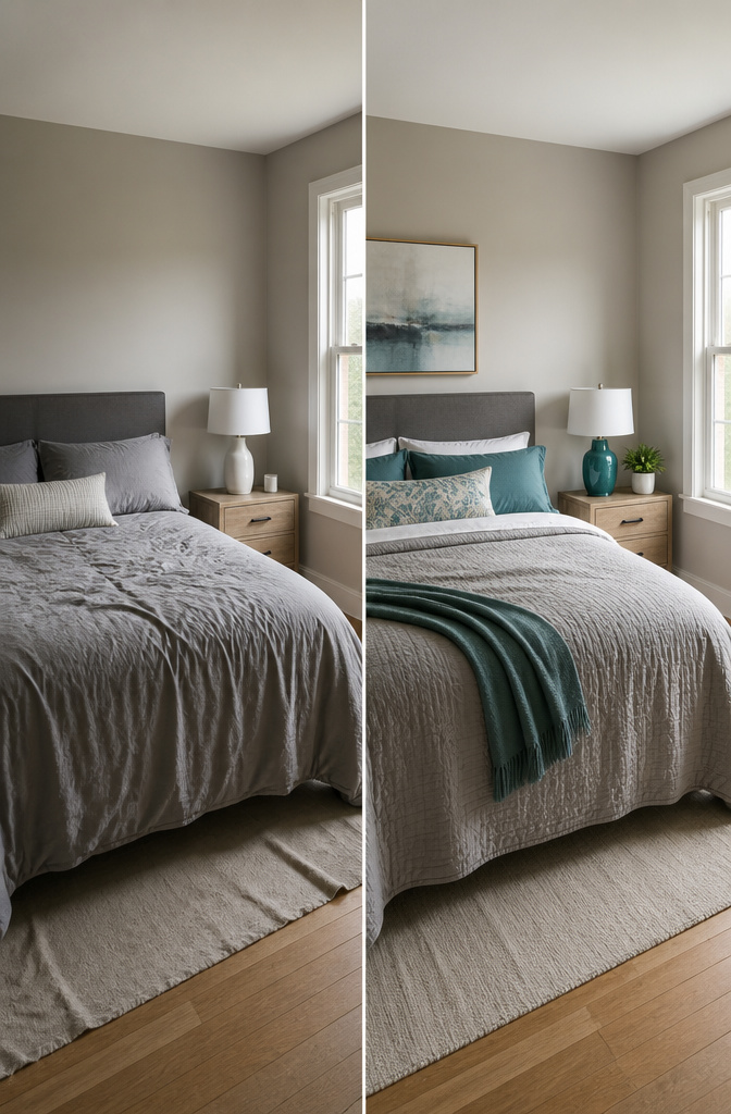
Sherwin-Williams Comfort Gray SW 6205 looked like the muted, warm grey I wanted on the chip, but full walls of it swallowed the light in my north-facing bedroom. The color went muddy by late afternoon, so I shifted half a step paler to Sherwin-Williams Agreeable Gray and got the airy base I was actually after.
Teal came in through a ceramic lamp, two pillowcases, and a single vase. That was the dose. Three teal items, no more, or the room starts reading tropical instead of calm. My first try was a bolder, greener teal on a throw blanket that sat too close to the lamp. Together they looked like a beach rental. Swapping the blanket for a charcoal knit fixed it; the teal stayed special because it stayed scarce.

Material:Flannel, Screen printed design, No smell;

Material:Flannel, Screen printed design, No smell;

Material:Flannel, Screen printed design, No smell;
5. Beachy Ocean Palette
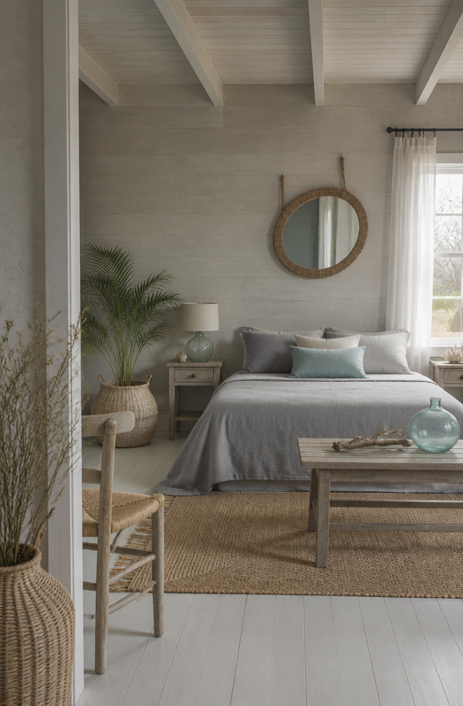
Driftwood grey reads coastal when the color lives in the material, not on it. Linen is the shortcut. I bought an Ikea duvet in a greige that turned too beige after one wash, so I bleached it twice until it hit that sun-faded dock-wood tone. The second bleach weakened the weave slightly, which turned out useful: the fabric now wrinkles in a way that looks like tide-washed cotton rather than slept-in bedding.
The mirror was a rope-framed circle I hung with two hooks instead of a wire. It sat crooked for a week before I patched the drywall, switched to a single anchor, and centered it properly. The mistake matters because the rope already reads beach-shack; crooked would have read garage-sale.
Pale aqua works here only if it stays quieter than the grey. A single sand-colored pillow or a water-glass tint in a ceramic lamp does the job. Nautical demands anchors and stripes. Coastal just needs the colors to look like they were left outside.
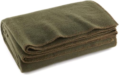
Olive green Military blanket - a Similarly styled blanket to that issued in the Military. An especially durable and dependable blanket that's ideal for camping, Hunting, or other outdoor activities.

OLIVE GREEN MILITARY BLANKET - A similarly styled blanket to that issued in the military. An especially durable and dependable blanket that's ideal for camping, hunting, or other outdoor activities.

OUTDOOR BLANKET: Military-style blanket for cozy warmth; ideal for camping, hiking, or other outdoor activities
6. Dramatic Scenic Wallpaper
A dark grey bedroom can swallow a mural whole if you let it. I learned this the hard way after ordering a moody forest print, the kind with pines fading into mist, and taping a sample to my already-painted charcoal wall. The room became the wallpaper’s room. Nothing else registered.
The $400 price stopped me from going through with it. Not because I couldn’t afford it, but because that much money for something that would dominate every morning felt like a hostage situation.
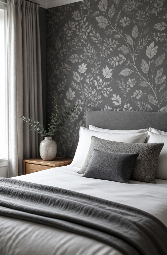
I ended up with a grey-scale botanical instead, leaves and stems in slightly lighter and darker greys than the wall behind it. It sits on one wall, behind the bed, and from the doorway it reads as texture rather than a statement. The room still belongs to me. Or to sleep, which is the same thing.
The move is choosing paper that stays inside the color story you’ve already set. If the mural introduces a new palette, the wall wins and the room loses.

Precise Positioning – We provide right angle auxiliary measuring cardboard for precise positioning when installing inside and outside frames

𝗠𝗼𝗱𝗲𝗿𝗻 𝟯𝗗 𝗧𝗲𝘅𝘁𝘂𝗿𝗲𝗱: 3D wood slat design creates depth and visual interest while enhancing sound absorption. Great for Bedroom, office to reduce echo and noise, both practical and stylish

Transformative Design - This peel and stick wall molding kit features pre-cut wainscoting panels that add classic charm and depth to any room; perfect for creating a stylish accent wall with easy installation using peel and stick molding trim for walls
7. Spa-Like Modern Retreat
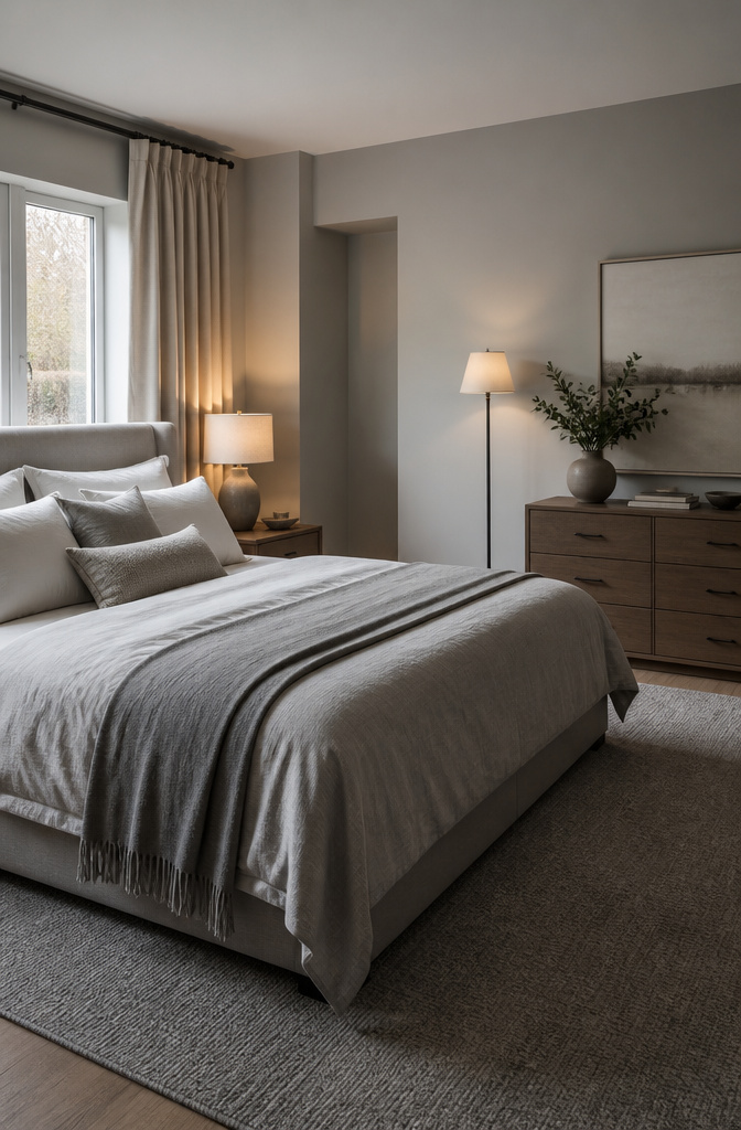
Pale stone grey on a bedroom wall reads as rest only when nothing else competes for attention. I started two swatches on the same north-facing wall one February afternoon: Benjamin Moore Dove Grey against Sherwin-Williams Popular Gray SW 6071. Dove Grey carried a whisper of warmth that held steady after sunset; Popular Gray cooled toward violet and turned the corner by the closet vaguely institutional. Dove Grey won because it needed no other color to feel finished.
The mistake I almost made was lighting it cold. Overhead cans at 5000K flattened the paint into something clinical no matter the undertone. What worked was layering warm bulbs at three heights: 2700K bedside lamps, a matching flush mount, and a dimmable floor lamp in the corner. The wattage itself mattered less than keeping every source under 3000K and on a dimmer. At half brightness the wall color softened to the point where texture, not tone, became the thing you noticed. A linen headboard in oyster grey helped; linen carries slub and shadow so it reads soft rather than flat. I skipped the rug at first and the floor leached heat right back out of the room. A pale grey wool blend with a deep pile, underfoot on both sides of the bed, fixed what the paint alone could not.
Adjustable height allows the headboard to fit your preferred setup perfectly.

MODERN UPHOLSTERED DESIGN WITH ENHANCED COMFORT — Featuring a wide cushioned headboard and soft beige upholstery, this queen bed frame creates a warm, inviting bedroom atmosphere while providing comfortable back support for reading, relaxing, or watching TV. The clean modern silhouette blends effortlessly with contemporary, minimalist, and transitional décor styles
Adjustable height allows the headboard to fit your preferred setup perfectly.
8. Scandinavian Clean Lines
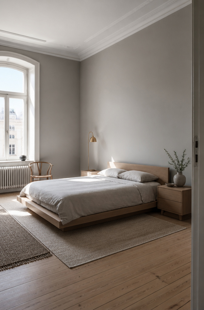
Pale warm grey reads softer than the cool Scandinavian greys that flood Pinterest boards, and the paint that finally worked in my bedroom was Farrow & Ball Ammonite No. 274, a warm stone tone that shifts with the light rather than flattening it. I paired it with white oak nightstands and a simple platform frame, keeping the palette to almost nothing: no pattern in the bedding, no print on the walls, just the grain of the wood and the slight variation between wall color and ceiling white.
The one thing that breaks the rules is a vintage brass floor lamp I kept from my last apartment, its patina too green to match the oak and too ornate for the spare lines around it. It works because the room needs one object that looks handled and slightly wrong; without it, the space photographs like a showroom and lives like one too.
Swedish design leans on proportion that American rooms rarely have. The tall windows and high ceilings in Stockholm apartments let pale colors breathe vertically; in an eight-foot-ceiling bedroom, the same palette can feel compressed and dim. The fix is not to abandon the grey but to keep it warmer and the wood lighter than the sources suggest, pushing contrast toward the floor rather than the walls.

Classic Chesterfield Design: Deep button tufting, rolled arms and decorative nailhead trim give this faux leather storage bench a timeless Chesterfield look, adding an elegant touch to bedrooms, entryways, hallways and living rooms.

Tufted Ottoman Bench with Storage: Our foot rest ottoman with storage for living room decor transforms your space and reduces clutter, and can be used as a storage ottoman coffee table or additional seat, supporting a max weight of 660 lbs.

Basic parameters: Overall: 13.8 "D x 43.3" W x 17.8 "H; Seat height: 17.8" H; Storage capacity 32L; Maximum load capacity of 500LBS; with flipping cover;
9. Rough-Cut Plank Pine
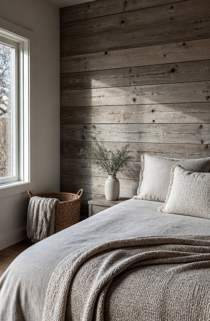
Rough-cut plank pine only works if you let it look a little ruined. The boards need saw marks, uneven edges, knots that refuse to behave, because a grey wash on perfect wood just reads as dirty paint.
I used Minwax Weathered Oak cut about half with mineral spirits, brushing it on fast and wiping before it dried. That part went fine. The trouble came from knots I had not sealed, which bled tannin through the wash overnight and left orange-brown rings everywhere the grey was supposed to sit. Seal your knots first with shellac or a stain blocker, or you will sand them back to raw wood like I did.
The weekend I planned for finishing turned into two days of sanding with 120-grit, re-washing, and waiting for the second coat to cure. The rushed first coat cost me the time I was trying to save.

Prepasted easy walls material

Comfortable Material - The throw blanket is made of quality flannel fabric with a delicate, cozy and soft touch that brings a cloud-like wrapping experience. It provides excellent warmth even in cold seasons, suitable for the whole family to use

FULL-LENGTH VIEWING: 63"x24" oversized mirror lets you check your entire outfit head to toe — wave-arched frame instantly opens up any room
10. Soft Blue Romantic Accents
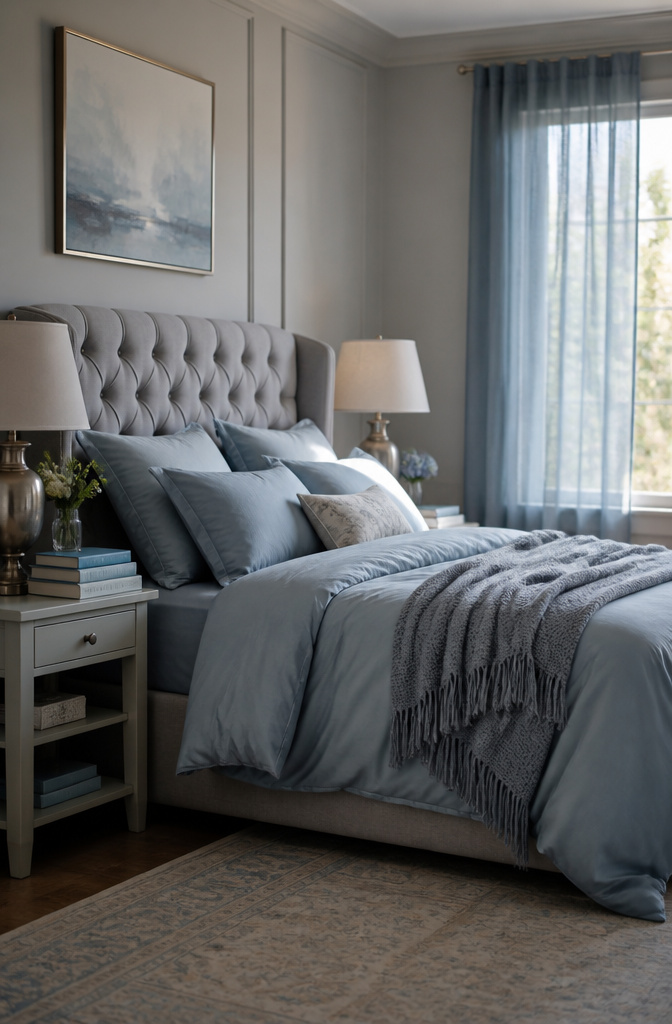
Dusty blue, not navy or cobalt, is what keeps a grey bedroom from turning into a cave. I nearly went with Farrow & Ball Pigeon No.25, that blue-grey that reads almost stone in some lights, but swatched it on the east wall and watched it flatten to nothing by four o’clock. The blue I ended up with carried a little more pigment, enough to catch morning light through sheer panels and still hold shape by evening.
The romantic grey bedrooms that actually work need more light than the moody Pinterest boards suggest. Sheers in that softened blue filter what comes through the window instead of blocking it, and bedding in the same dusted tone reflects it back around the room. Keep the two colors in the same temperature family: warm brown-greys with warmer blues, cool greys with cooler ones. Mix the temperatures and the whole thing goes muddy.
Brushed nickel on the lamp bases or hardware keeps the cool side from going cold, and soft white bedding underneath keeps the blues from looking like a mistake with the grey. The mistake is thinking the blue does all the lifting. It does not. The light does, and without enough of it you are left with walls that look like a decision you regret.

Warmth and Comfort: Our Woolly Mammoth Wool Blanket, made with a 50% wool blend, provides a soft wool blanket experience that naturally traps warm air. Ideal for outdoor blanket adventures, it supports you through cold nights and breezy days

14 wool felt applique projects include bed covers, wall hangings, and table runners. A guide for beginners, seasoned stitchers, traditional quilters, embroiderers, textile artisans, and general crafters. Instructions on finding and repurposing wool. 96 pages

European Surplus Style Wool Blanket
11. Layered Textured Fabrics
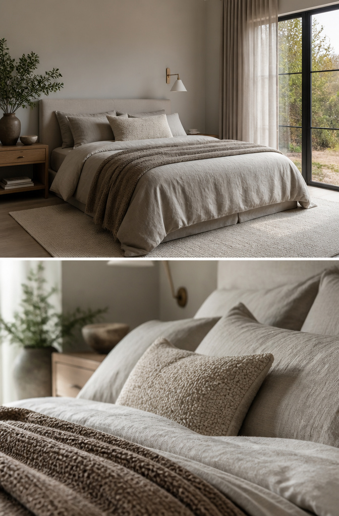
Velvet reads as luxury until you live with it, and then it reads as cat hair magnet. The grey I chose for my bedroom started with a velvet euro sham that looked perfect in the store and spent the next two years collecting everything floating in the air. That mistake taught me to build the rest of the room in fabrics that forgive more: a linen duvet, a boucle accent pillow, a wool throw at the foot of the bed. All in the same greige family, none of them matching, none of them patterned.
The piece that actually tied them together was a synthetic chenille throw in warm greige I bought after the real wool started pilling where my heels dragged. It is the only petroleum-based fabric in the room, and it is the one guests reach for first because it is soft and it is warm and it does not demand dry-cleaning. The linen duvet cover, by contrast, goes to the dry cleaner once a season, maybe twice if the windows have been open. I have tried washing it at home. It comes out with a texture I do not like, and the wrinkles settle into creases that look like mistakes rather than character. The cost of four dry-cleaning runs a year is worth the sleep I get from a bed that actually feels calm, not like a project waiting for me.
12. Bold Graphic Accents
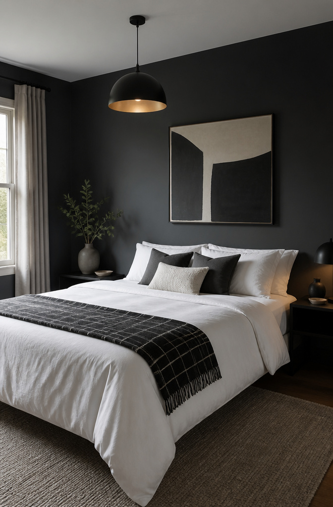
Grey walls read as neutral ground until you push them toward something specific. I tried charcoal first, rolling it floor to ceiling on the back wall only, and the depth changed everything: the bed became the focal point without any headboard at all. The paint was Benjamin Moore Kendall Charcoal, not quite black but enough to make white linens feel crisp against it.
For the graphic layer, I wanted stripes. A black-and-white rug with thick bands arrived first and lasted three days before I rolled it back up. The pattern fought the wall instead of talking to it, too many competing lines in too small a room. What worked was simpler: a single oversized grid in black on white bedding, the blocks large enough that each one read as shape rather than noise.
The fix that centered the whole room came last. I hung one matte black pendant dead center, low enough to pool light on the nightstand and cast a thin shadow line upward. One fixture, not a pair, because symmetry in a narrow room feels like a corridor. The black repeated the charcoal without matching it, and the geometry finally had a single point to orbit around.
13. Citrine Yellow Pops
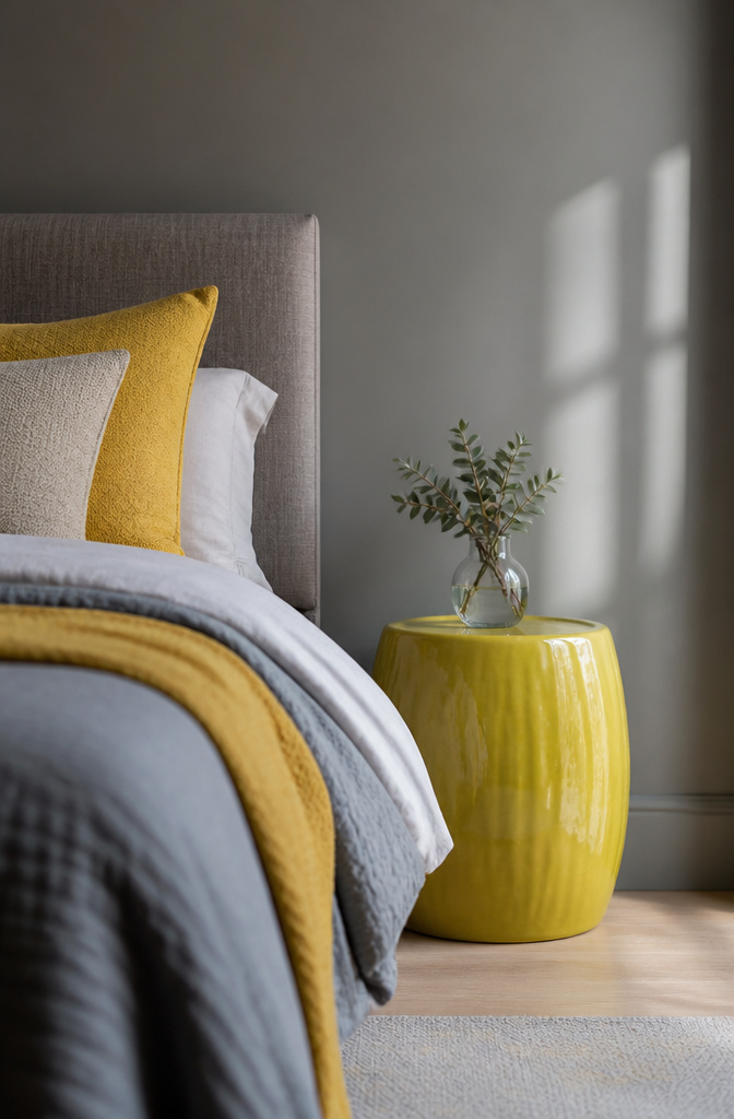
Grey walls swallow mustard whole. I learned that after painting a test patch of Kendall Charcoal HC-166 and propping a mustard lumbar pillow against it. The pairing looked muddy, like the color had given up before morning. Citrine yellow, the brighter, greener shade you see on Portuguese tiles and Thai silk, is what actually wakes grey up. Designer Vern Yip used it the same way in a Florida guest house: one concentrated hit rather than scattered accents.
The difference is one large piece versus many small ones. A single ceramic stool, a throw in that specific yellow-green range, or a painted bedside table carries the whole room. I found my stool at a flea market, solid enough to hold a stack of books, glazed in a yellow that leans toward lime. Against the charcoal wall it reads as energy, not decoration. Three small yellow objects would have looked like clutter trying too hard. One substantial piece lets the grey do its job of calming the room while the yellow does its job of keeping you awake when the alarm goes off.
14. Pleated Classic Shades
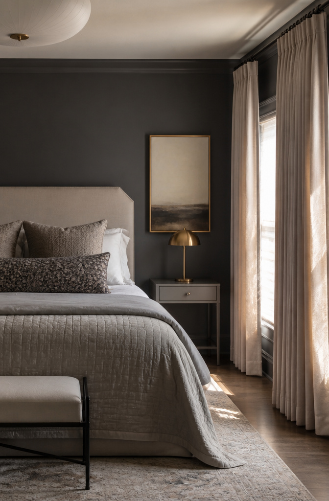
Pleated silk shades read as old money in a way that can tip into dated fast. The fix is editing: keep the shades, lose the matching skirted tables and button-tufted everything. Peppercorn SW 7674 on one wall gives the room enough contrast that the traditional details feel chosen, not inherited. That dark gray sits right between warm and cool, so it anchors both brass and chrome without fighting either. The silk shades themselves came from a maker I still use, though the name matters less than the proportion; a too-narrow pleat looks costume-y, and a too-wide one looks like a hotel lobby. My rule now is one traditional element per sightline. In this bedroom, the shades carry that weight, so the headboard stays simple and the nightstands go bare-legged. The mistake I made early was layering every classic detail I liked and ending up with a room that felt like a set. One ornate piece needs modern neighbors, or the whole thing reads as a stage for a life no one actually lives.
15. Airy Linen Canopy
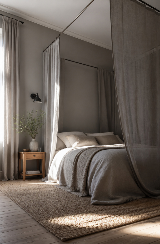
Pale grey walls read as shadow rather than color, which is exactly what lets a draped canopy frame pull the eye upward and stretch the ceiling. I matched the linen to Slate III from Paint and Paper Library, the same mid-grey the walls carry, so the fabric disappears into the plane behind it instead of declaring itself a separate object. The frame itself is electrical conduit pipe, the thin-walled steel you bend with a hand bender from the hardware store. It costs a fraction of a custom rod and holds the weight of washed linen without sagging across an eight-foot span. What I did not plan for was morning light. East-facing windows throw sun straight through grey linen at 7 a.m., and the glow turns the canopy into a lantern rather than a soft tent. A blackout liner behind the drapery layer fixes it, but that adds weight the conduit was not sized for. Next time I would step up to the next pipe gauge before I hung anything.
16. Dark Cozy Atmosphere
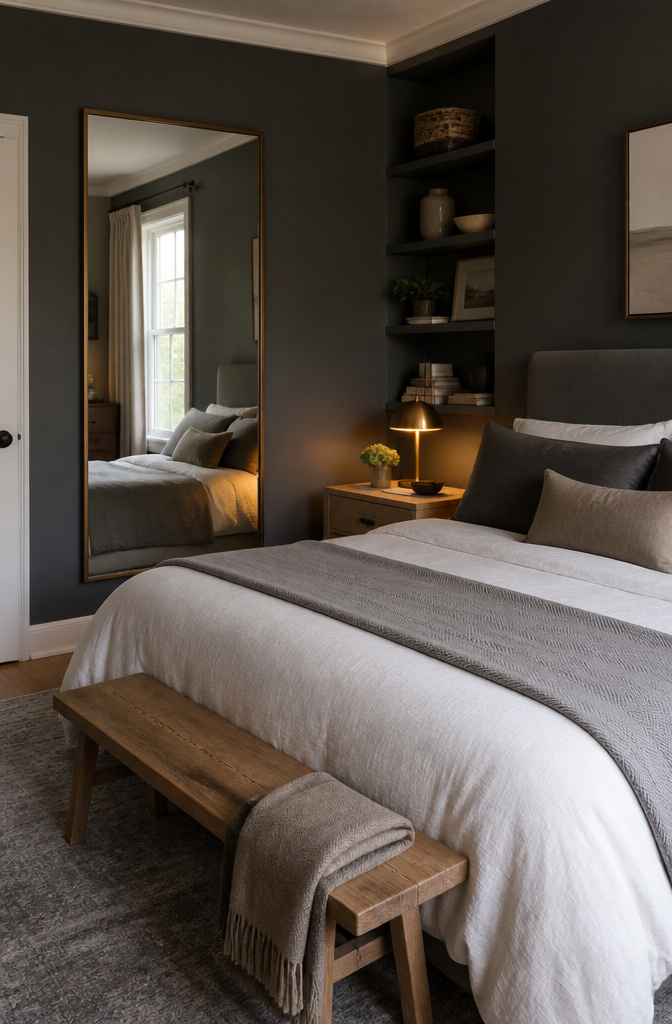
Charcoal walls swallow light, which is the point, but the paint sheen decides whether the room feels like a shelter or a tomb. I go with eggshell: matte enough to kill glare, satin enough that a candle or a phone screen still bounces back somewhere. Flat paint in charcoal is a black hole; full satin turns every wall into a mirror you did not ask for.
The cave needs an exit, and in my book that exit is a mirror placed opposite any window you have, even a small one. It does not brighten the room so much as give the dark a destination, a depth that tricks the eye into reading the space as larger than the dimensions. Without it, charcoal collapses inward.
Wood warms the rest: oak or walnut, nothing too finished, nothing that reads as office furniture. And the reading lamp matters more than people think. 2700K bulbs, never 3000K or above, keep amber in the amber; anything cooler pulls blue out of the charcoal and the room turns institutional. Age brass hardware if you can find it, the kind that stops grey from going grim.
17. Two-Tone Painted Brick
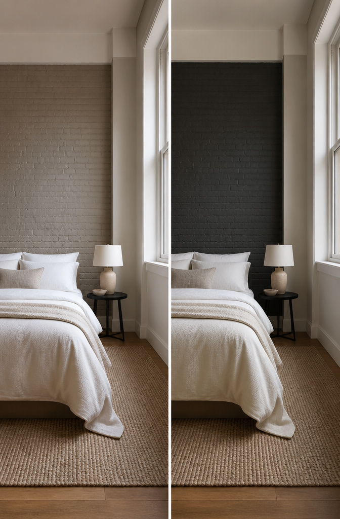
Brick grey and drywall grey are never the same grey, even when the paint can says they are. I learned this after painting my bedroom’s single exposed brick wall in a warm greige while the surrounding drywall got the same formula mixed at half strength. The brick drank the pigment differently, and by evening the two surfaces looked like they’d been painted a day apart.
The prep work I skipped cost me a weekend. I had assumed a quick wire brush and a coat of primer would handle the old fireplace brick. Instead, the kiln-fired surface shed powder for months, and the first coat of latex bubbled where residual mortar salts met the water base. A masonry conditioner, applied after a proper scrub with TSP substitute, would have saved the do-over.
I chose solid cover over whitewash because I wanted the wall to feel like architecture, not accident. Whitewash lets the brick’s natural variation show through, which is beautiful until morning light hits the orange undertones that grey is supposed to quiet. Solid cover flattens that out, though you lose the shadow play between mortar and brick face.
What surprised me was the evening shift. Morning sun from the east window made the solid grey read almost lavender against the drywall. By dusk, with lamplight, the brick wall sank to charcoal while the drywall held its mid-tone value. The texture didn’t just absorb light differently; it changed the color’s temperature hour to hour.
18. Statement Headboard Wall
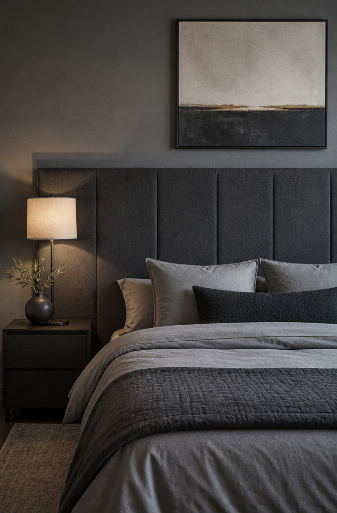
A full-wall upholstered headboard in charcoal linen runs about $2,800 installed, which is why I priced it, sighed, and started over. The floor-mounted version I built stands six inches off the grey wall on a simple 2×4 frame wrapped in batting and a heavy grey canvas from a jobber in North Carolina. Total came to $340, including the French cleat that actually holds it.
The first anchors I tried were standard toggle bolts rated for 75 pounds. They pulled straight out of the drywall the second morning, leaving two ragged holes I had to patch before work. The French cleat distributes the weight across four studs and rides flush enough that the headboard reads as part of the wall itself. One gesture replaces the art, the mirrors, the shelf above the bed. The grey behind it needs to be two shades lighter than the fabric or the whole thing goes flat; I learned that by brushing out three samples at 8 a.m. and choosing the middle one by lunch.
19. Layered Patterns
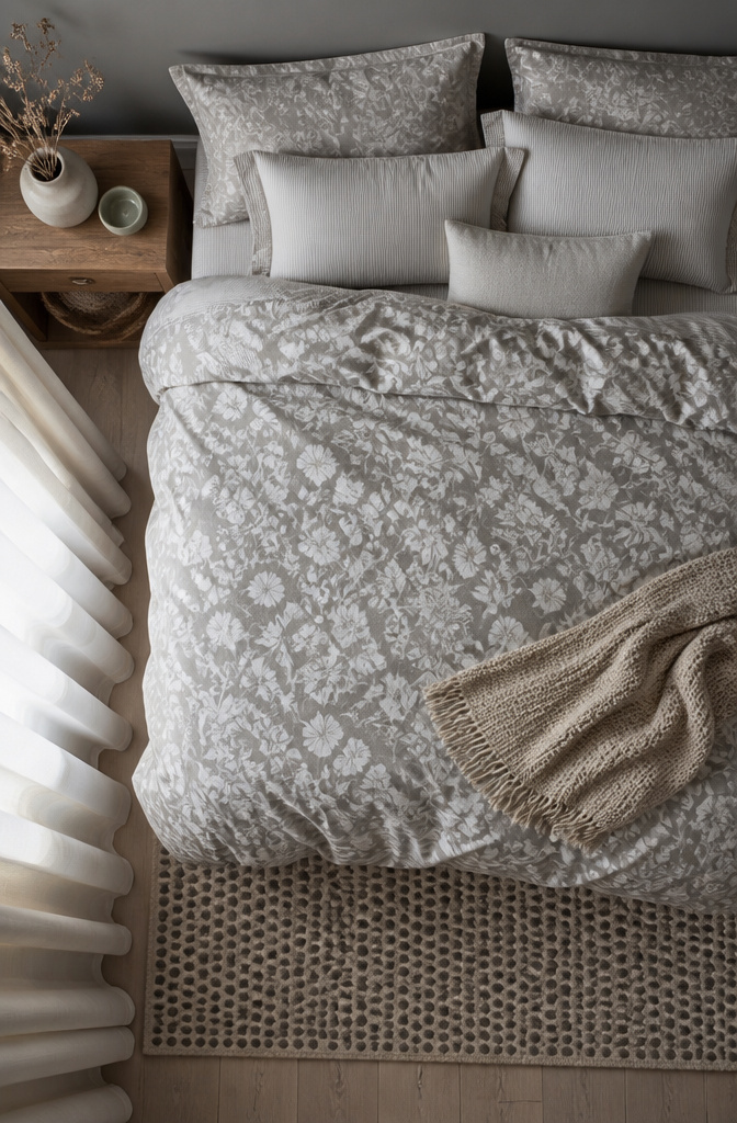
Grey walls let you build up pattern the way a white room rarely allows. I keep to a rule of three: one large-scale print, one medium, one small, and I stop there. In my own bedroom the bedlinen carries a loose floral, the curtains run a narrow inky stripe, and a spotted rug, something between animal print and watercolor, sits underfoot. Warm greys repeat in each piece so the eye reads them as belonging together rather than competing.
The pattern that always clashes, in my experience, is two geometrics at the same scale. A chevron pillow against a diamond rug fights for attention no matter how neutral the color. Stripes and florals, or a geometric with an organic, behave better because the shapes differ enough to read as intentional.
Grey forgives what white or beige would not. A warm white base makes every pattern feel louder and busier; beige tilts too yellow and starts arguing with cool-toned prints. Grey sits in the middle, cooling down warm prints and warming up cool ones, so the mix holds together even when the scale gets adventurous.
20. Natural Earthy Materials
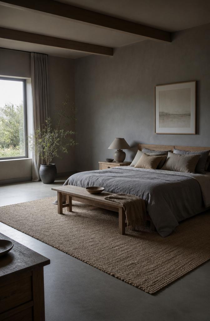
Stone and clay bring grey back to something it already is: weathered, quiet, and found rather than finished. A grey bedroom built on these materials reads expensive because the surfaces are real, but the cost stays low if you shop the raw state and stop before the polished one.
The first mistake I made was a terracotta pot that looked softly burnt in the store light and turned loud orange by morning sun against grey walls. Greyed oak or a limestone planter keeps the palette honest; the warmth comes from the material itself, not from color competing with the grey. Raw oak with its silvered grain costs less than white oak once you skip the staining step, and undyed wool throws or a hand-tufted jute rug carry the same logic. The wool pills and the jute sheds for a month, which is the trade for paying half what a dyed, sealed, showroom-ready version asks.
Clay lamps or a single unglazed vessel on the nightstand do the work of sculpture without the gallery price. The trick is leaving the surfaces alone. Sanding, sealing, or "protecting" raw wood usually means adding yellow; the grey you wanted disappears under the coating.
Frequently Asked Questions
Is grey a good color for a bedroom?
Yes, grey works in every bedroom style from traditional to minimalist, and its undertone sets the mood. Warm greiges like Farrow & Ball’s Cornforth White feel enveloping and cozy, while charcoals like Benjamin Moore Kendall Charcoal create depth and drama. The color pairs with almost any accent, from teal to citrine to cognac leather.
What colors go with grey in a bedroom?
Match your accent colors to the undertone of your grey. Warm brown-greys pair naturally with cognac leather, dusty blues, and heathered wool; cool greys work with crisp whites and pale aquas. Teal stays calm at three items or fewer, and citrine yellow wakes up charcoal without going muddy like mustard.
How do I stop a grey bedroom from feeling cold?
Choose a warm undertone like Farrow & Ball Ammonite or Benjamin Moore Dove Grey, then layer light at three heights using bulbs under 3000K. Natural textures help: linen with slub and shadow, oak or walnut wood tones, and a deep-pile wool rug underfoot. Flat paint in charcoal turns walls into black holes; eggshell bounces back candlelight and phone screens.
What is the best grey for a small bedroom?
Pale warm grey opens up the space without flattening. Benjamin Moore Dove Grey held its warmth after sunset in one test, while cooler options shifted toward violet and read institutional. Keep wood lighter than Scandinavian sources suggest and push contrast toward the floor rather than the walls in rooms with standard eight-foot ceilings.