
The best bathroom paint ideas span from barely-there off-whites to saturated emeralds and plums, but the one that works for you depends on what your existing fixtures already demand. A warm vanity under cool gray paint reads as dirty; match the undertone, not the color itself. Benjamin Moore’s Simply White keeps showing up in small bathrooms because it bridges brass and chrome without fighting either.
1. Soft Blues
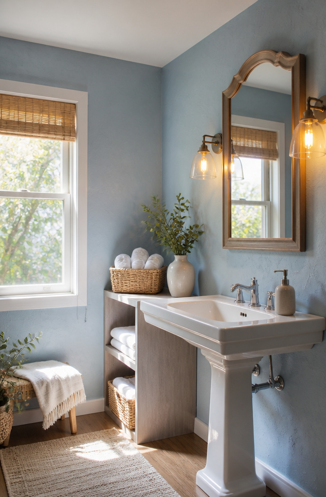
Morning Sky Blue carries a clean, airy quality that opens up a small bathroom without feeling sterile. In natural light it reads closer to a pale sky with a faint cool undertone; under warm vanity bulbs the same wall shifts noticeably greener, almost sea-glass, which can clash with chrome if you are not expecting it. I would test it on two walls and check it at the hour you actually shower.
White porcelain and chrome fixtures play well with this shade because the coolness in each keeps the palette from muddying. Brass or matte black hardware would fight it, in my view, though the sources do not push that pairing.
For finish, satin or semi-gloss is the practical call in a bathroom. Satin hides the odd wall imperfection; semi-gloss reflects more light and wipes down easier near the sink. Both resist moisture better than the flatter sheens.

Prewash fabric before painting to remove sizing.

Prewash fabric before painting to remove sizing and do not use fabric softener

CONVENIENT SIZE - This Apple Barrel Acrylic Paint comes in a versatile 8 oz size that is great for basecoating, stenciling, and so much more
2. Soft Greens
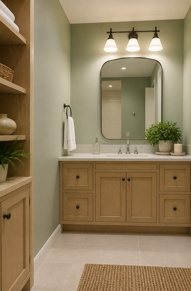
Soft greens read as a quiet gamble until you see them in a bathroom with no window. Mint Condition sits in that space between color and neutral, green enough to feel alive but pale enough that it does not fight dim light. In a bathroom with little natural light, the shade stays consistent through the day rather than shifting into something muddy or too sweet.
The finish matters more than the color itself. Satin holds up against steam without the mirror-like glare of semi-gloss, and it does not show every wall flaw the way high-gloss will. Eggshell is softer still, though in a room that sees daily showers the moisture resistance of satin usually wins.
Existing tile is where this choice lives or dies. Mint Condition pairs cleanly with white or cream tile, and it can work with gray if the gray runs cool rather than warm. Against beige or terracotta tile it turns sickly, the undertones fighting each other. If your tile is already in place, test a sample on two walls and check it morning and evening under the lights you actually use.

Customize your favorite accessories, transform an ordinary object or restore special items with this leather paint - ideal for painting boots, jackets, athletic shoes, purses and more.

Sfpt Opstk Soft Matte Green 2Oz

ALL-IN-1 PAINT & PRIMER: A hardy multi-purpose and multi-surface one-coat paint and primer in one for almost any indoor or outdoor surface. A wall, ceiling, floor, skirting board, cabinet, furniture and door paint for your bathroom, kitchen, home and garden.
3. Soft Grays
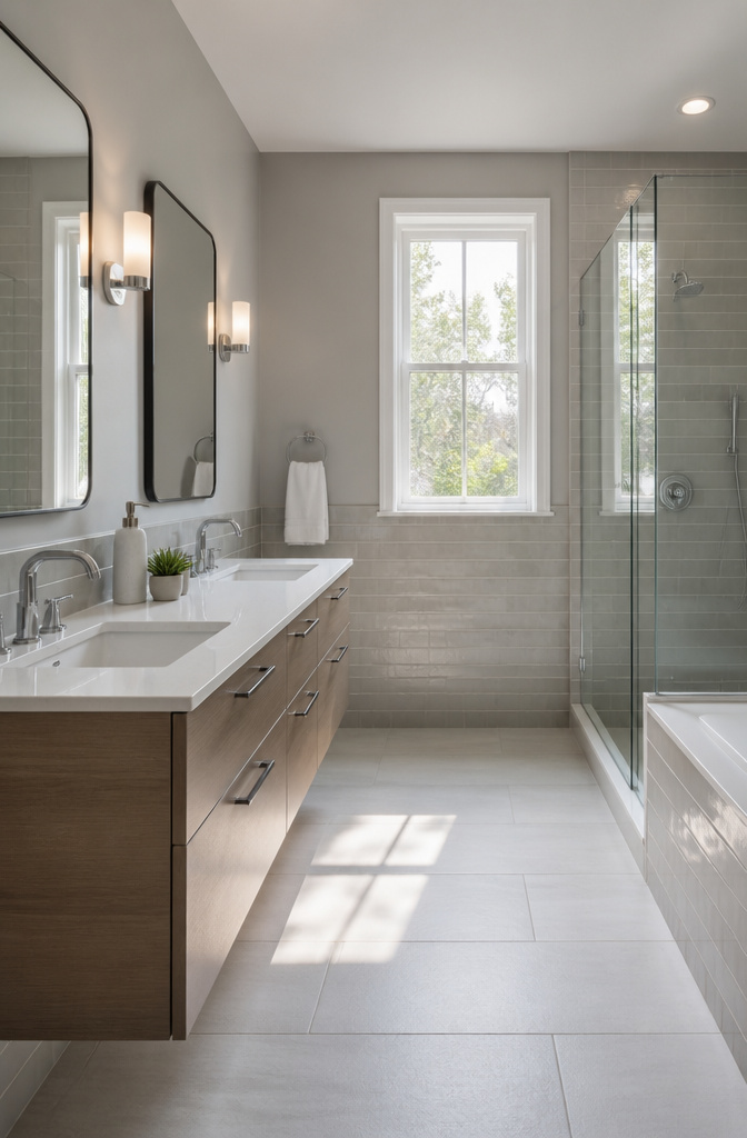
Soft gray reads as a chameleon in bathrooms, and that is exactly why it works. Metropolitan AF-690, Benjamin Moore’s 2019 Color of the Year, sits in this family: a quiet backdrop that lets chrome or matte black fixtures step forward without fighting for attention. The same wall can pull warm at sunrise, cool under a vanity bulb, or flat-out blue-gray at midday, so testing samples on multiple walls and checking them at the hours you actually use the bathroom matters more than with bolder colors.
Tile plays into the choice too. Subway tile with subtle gray undertones balances especially well here, which is useful in shared bathrooms where tastes clash.
For finish, satin is the practical call. It adds just enough gloss to handle moisture and wipes clean without the mirror-like glare of semi-gloss that shows every drywall flaw you did not fix. Eggshell hides imperfections better but offers less protection against steam; semi-gloss is durable but can feel clinical on broad walls. Satin lands in the middle, and in a weekend project where you are painting once and living with it for years, the middle is usually where you want to be.

Ideal for use on interior/exterior surfaces including wood, plastic, plaster, metal, masonry and unglazed ceramic

Weather and corrosion resistant coating protects exterior/interior surfaces like wood, metal, concrete, masonry and more

Ready to use, pre-mixed door and trim paint offers a fresh new look on interior or exterior metal, wood and fiberglass
4. Off-Whites
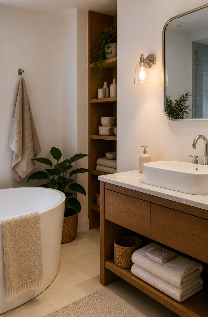
Off-white hides the wear that pure white broadcasts. Where stark white turns every water spot and scuff into a headline, a shade like Benjamin Moore’s Ballet White OC-9 or Feather Down 953 lets the same marks sink into the color itself. That matters in a bathroom where fixtures age faster than the walls around them. A sink with ten years of mineral buildup looks less orphaned against a wall that isn’t trying to be perfect.
The shift from fluorescent to LED lighting changes what you see. Fluorescent tubes throw a cool, flat cast that pushes off-white toward gray and can make it feel institutional. LEDs, especially the warm-temperature bulbs most people install now, bring out the cream or the barely-there pigment that separates off-white from plain white. Order samples and look at them under your actual bulbs at the hour you usually shave or put on makeup, not just at midday. Chantilly Lace OC-65 reads crisp and almost-white under bright LED; the same color under old fluorescent can look like a hospital corridor. The paint doesn’t change. The light does.

COLORS CRAFTED BY ANNIE SLOAN: Tyrian Plum is a dramatic, rich, jewel-toned plum with both maroon and red elements. It’s Annie’s homage to the ancient pigment, Tyrian purple (a shade reserved for Roman emperors). This deeply saturated maroon will flatter most spaces and generate an indulgent atmosphere. A regal yet mellow shade, the warmth, ripeness and depth of pigment in Tyrian Plum make it an ideal choice for dining spaces or bedrooms.
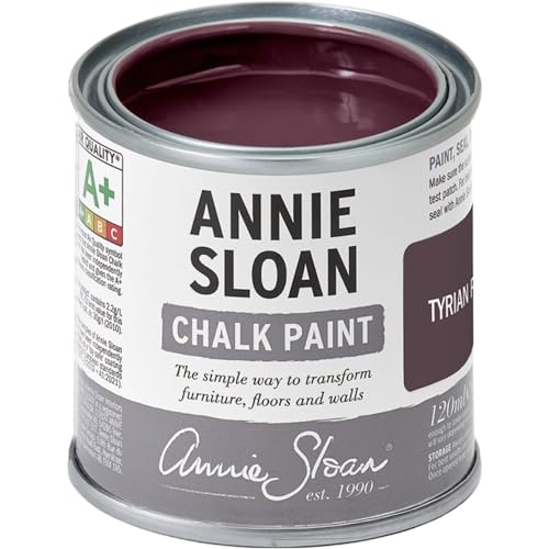
COLORS BY ANNIE SLOAN: Tyrian Plum is a wonderfully sophisticated earthy dark reddish-purple color with real warmth and depth.
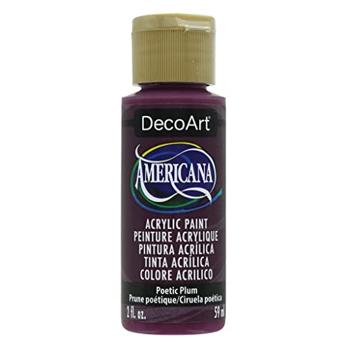
Americana Acrylic Paint 2oz-Poetic Plum
5. Lavenders
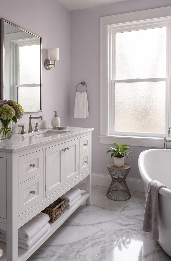
Lavender has hung around bathrooms since the color was literally named after the herb people hung in bathrooms. The old versions could read sugary, like something chosen for a guest soap. Modern lavenders pull back on the pink undertone and sit closer to a cool gray-purple, which keeps a small room from feeling like a confection.
Satin or eggshell is the safer call here, not matte. Lavender shows water spots and streaks more readily than neutrals do, and a touch of sheen lets you wipe them without leaving a ghost. I learned that the hard way in a rental with a windowless bath where every splash left a mark on the flat paint the landlord had chosen.
Nickel hardware sharpens lavender up and keeps it from drifting sentimental. Brass does the opposite, warming it toward something more 1970s revival, which works if your fixtures already lean that direction. Chrome lands in the middle and reads a little bland against this particular shade, though it will not fight it. If you are painting trim too, keep it in the same family but two steps lighter or darker so the room does not flatten into one flat field of purple.

Use for a variety of indoor and outdoor project surfaces including wood, metal, plaster, masonry or unglazed ceramic

Use for a variety of indoor and outdoor project surfaces including wood, metal, plaster, masonry or unglazed ceramic

Ideal for use on interior/exterior surfaces including wood, plastic, plaster, metal, masonry and unglazed ceramic
6. Warm Beiges
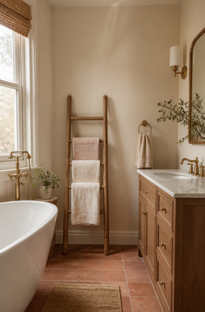
Warm beige lives in the space between stark white and true tan, and in a bathroom that gray zone is often where the light actually lands. Ballet White (OC-9) carries enough pigment to stop a shadowed corner from going flat, but not so much that it fights a small window or a single vanity bulb. The color reads as soft plaster rather than painted wall, which helps when the tile already has its own ideas.
Satin or semi-gloss sheen matters here more than the hue itself. Flat paint in a steam zone is a maintenance headache; the slight gloss bounce also helps the beige throw what light it catches back into the room. I would not go full semi-gloss on a large wall unless the bathroom is genuinely dim, but satin is the safe middle.
Where this tone earns its keep is between tile palettes. Warm beige bridges cool gray stone and warmer terracotta or wood-look floors without forcing either side to win. If the existing tile is already doing something loud, Ballet White steps back and lets it.

VINTAGE IMPRESSIONIST HUMMINGBIRD WALL ART: This hummingbird wall art features a delicate bird in flight against a soft pastel nature background, blending impressionist brush texture, airy blue-green tones, and peaceful movement to create an elegant focal point for your home
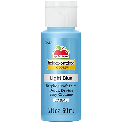
CONVENIENT SIZE - This Apple Barrel Gloss Acrylic Paint comes in a versatile 2 oz size that is great for basecoating, stenciling and so much more

【Quality & durable bristles】scrub brush boasts extra-tough fibers and Bushy for easy scrubbing of large areas. it can produce rich foam,Efficiently clean hard-to-clean dirt around your bathroom or kitchen.it can be used on household, bathtubs, tile walls, countertop, shoes and kitchen, laundry living room, bathroom, provide safe, gentle cleaning
7. Terracottas
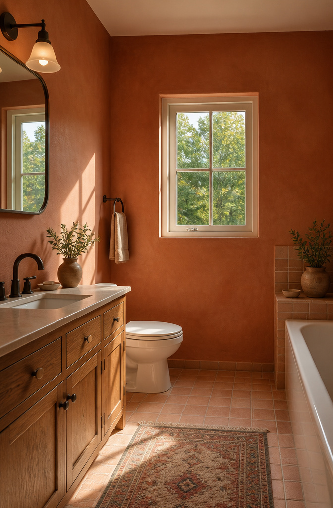
Terracotta walls turn a bathroom into something that feels lived-in rather than staged, and the shift toward these warmer, earthen colors makes sense once you see them against white porcelain and running water. The clay tones pull the room back from coldness without crowding it, which is the usual risk when you move away from neutrals in a small space.
Morning light and overhead bulbs read very differently on terracotta, so testing matters more here than with a soft gray. The paint can shift from warm peach under a north window to something almost rust under old incandescents. I would swap the bulbs before repainting; a 3000K LED keeps the color honest.
Brass and matte black fixtures settle in quietly against terracotta. Chrome fights it, reading too cool and too loud. Wood vanities, especially oak with some grain showing, extend the same earth logic into the furniture rather than breaking it. If the trim is white, keep it warm white; a stark trim line will make the walls look dirty rather than intentional.

This product is Non-toxic

SOFT & COZY- 100% Cotton. Make your bathrooms feel like luxury hotel spas. Step onto fluffy bathrugs with anti-skid latex sprayed backs.

Ultra premium paint and primer in one
8. Warm Yellows
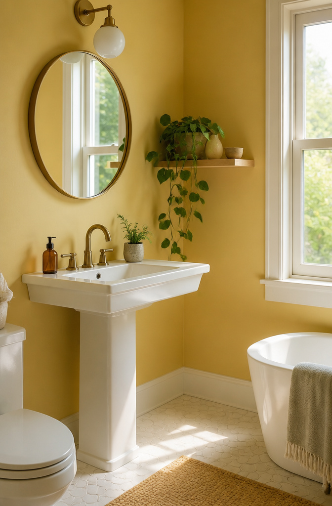
Warm yellow can read like a hospital corridor if the saturation tips too high. I learned this the hard way when a sample I loved on a chip turned into something resembling a school bus once it hit the wall. The safe range sits closer to butter than to lemon, a muted ochre that keeps its warmth without shouting.
Morning light pulls out the golden side and makes the room feel genuinely sunny, but that same paint under evening bulbs can thicken toward mustard. Testing samples on multiple walls and checking them at both times of day is not optional here.
For finish, satin or semi-gloss handles the steam and the wipe-downs. Eggshell will show every water spot, and high-gloss under yellow turns a bathroom into something closer to a diner booth. Satin hides the wall’s small sins while still letting you clean the surface when toothpaste splatters.

Zombie prom queen costume girl includes a gray satin and black mesh layered dress with purple rose chest trim and printed belt detail, a prom queen sash with black sequin edging, a purple satin rose wrist corsage, and a

ALL-IN-1 PAINT & PRIMER: A hardy multi-purpose and multi-surface one-coat paint and primer in one for almost any indoor or outdoor surface. A wall, ceiling, floor, skirting board, cabinet, furniture and door paint for your bathroom, kitchen, home and garden.
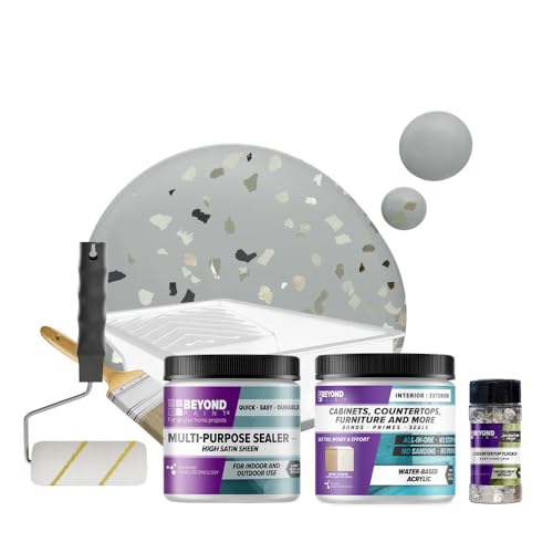
Kit includes: One pint of Beyond Paint, pint of Multi-Purpose Sealer, Flecks, paint tray, 3/4" microfiber roller, 4" roller handle and paint brush
9. Bold Navy Blues
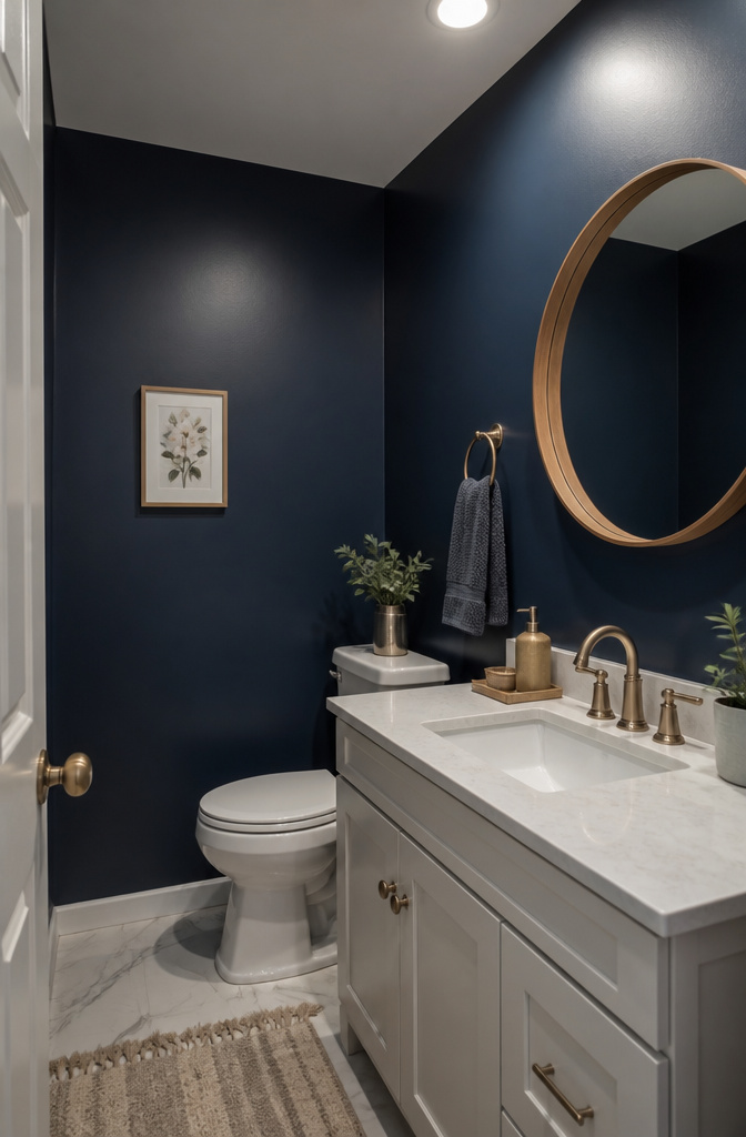
Navy reads as near-black in a bathroom with weak light, so the finish matters more than it does for paler shades. A satin or semi-gloss sheen catches what light exists and keeps the color legible as blue rather than shadow. Moscow Midnight works at either scale: as a single accent wall behind a vanity it behaves like a deep neutral, while a full room wrap turns it into the statement the sources describe. White fixtures against it need enough contrast to avoid looking accidental rather than intentional; the trim and ceiling should stay clean white rather than cream, which muddies the edge. In my own reading, the higher sheen that makes dark colors look luxurious is also what prevents the black-hole effect in a space that rarely gets natural light.

PAINT ANYTHING YOU WANT - Ideal for painting wet surfaces such as tubs, bathrooms, tiles, sinks, and other places such as kitchen cabinets, wood, plastic, concrete, marble, metal, and more


DARK PURPLE CHALK PAINT - This tone is a beautiful plum eggplant purple chalk paint. Our paint is matte, spreads like buttercream and is washable.
10. Emerald Greens
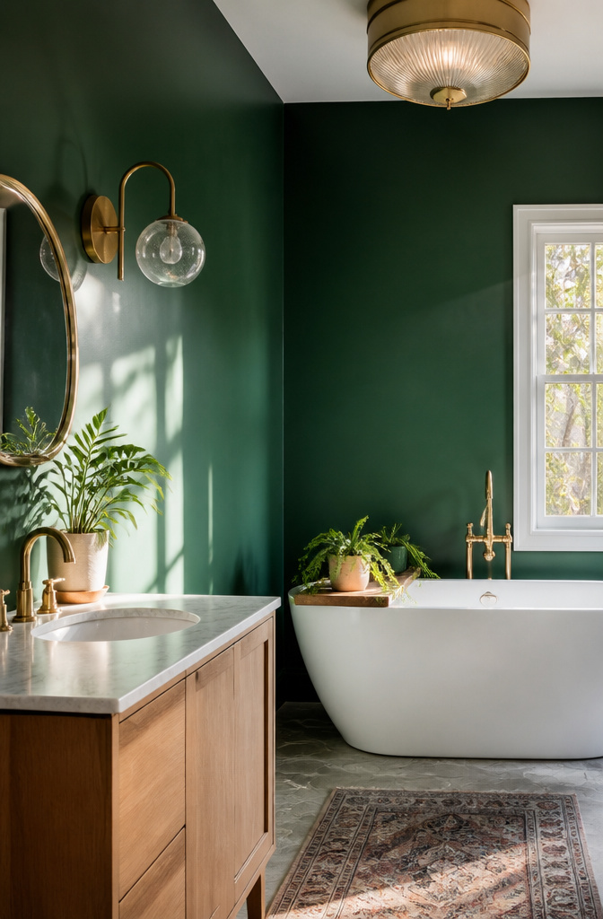
Emerald green reads as jewel-like in a bathroom that gets real daylight, where the sun picks up the blue undertone and keeps the color from going muddy. In a windowless bath or one that relies on overhead cans after dark, the same shade can flatten to something closer to black-green, and the fixtures start to look like they belong in a different room. The fix is not to skip the color but to test it under the actual bulbs you use at 6 a.m. and at 10 p.m., not just at the paint counter.
The saturation works best with metals that can hold their own against it. Brushed brass and unlacquered copper both warm the tone without competing; chrome and cool nickel tend to read flat and a little dated against this particular green. For tile pairings, white subway with warm grout or a terrazzo with stone flecks both give the eye a place to rest. If the tile is already busy, keep the trim in the same emerald so the walls and woodwork read as one continuous plane.
We recommend Modern Emulsion for bathroom walls and ceilings. Protected against mould, it’s perfect for these steamy spaces.
That finish call from Farrow & Ball matters here because a flat or matte sheen on a saturated color in a steamy room is asking for water stains and mildew you cannot wash off. Satin or an eggshell with mould protection lets you clean the walls without dulling the depth that made you choose emerald in the first place.
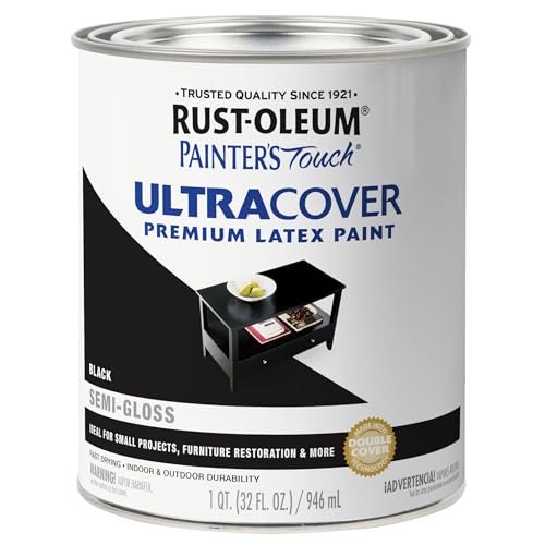
Use for a variety of indoor and outdoor project surfaces including wood, metal, plaster, masonry or unglazed ceramic
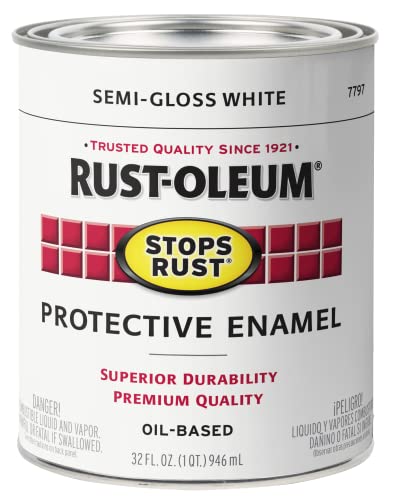
Weather and corrosion resistant coating protects exterior/interior surfaces like wood, metal, concrete, masonry and more

Use for a variety of indoor and outdoor project surfaces including wood, metal, plaster, masonry or unglazed ceramic
11. Charcoal Grays
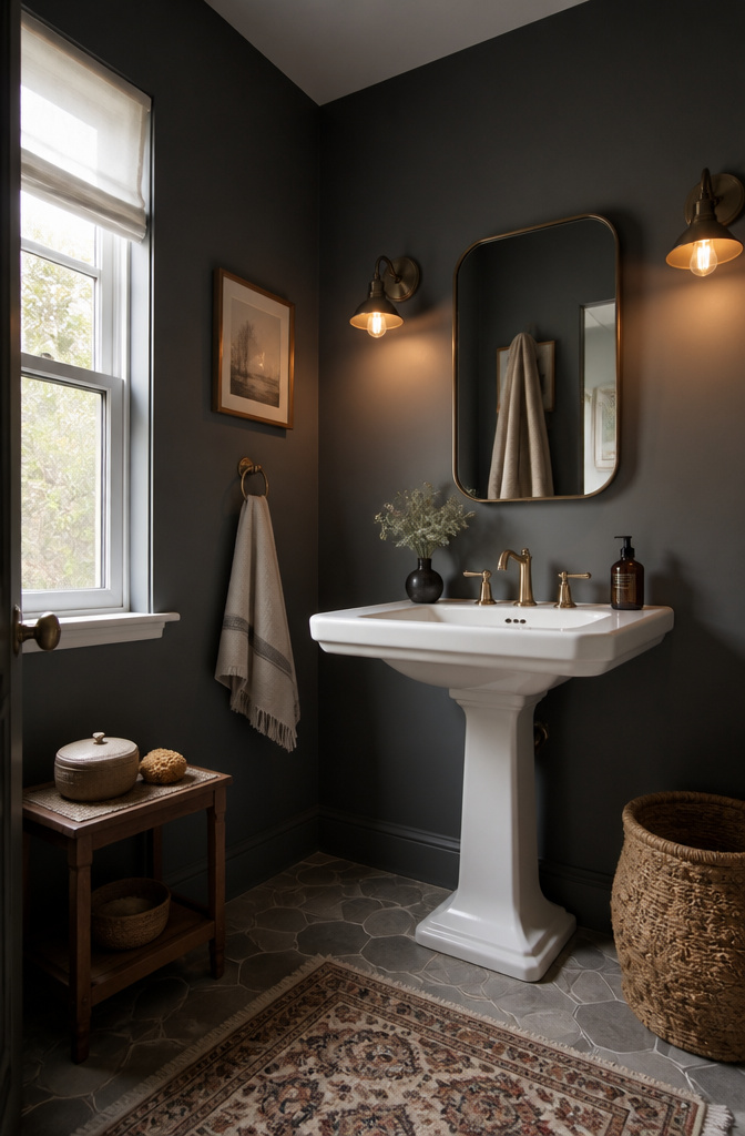
Charcoal gray reads as dramatic without the maintenance headaches that come with true black. Water spots and soap residue that would glare on a jet-black wall tend to dissolve into the mid-tone depth of something like Kendall Charcoal HC-166, so the bathroom keeps its polished look longer between wipe-downs.
The catch is artificial light. Warm bulbs pull charcoal toward brown; cool LEDs can flatten it to a flat battleship. Multiple sources, vanity plus overhead plus any window, mean the color shifts by the hour. Paint chips on two walls, checked morning and night, show whether your particular gray stays rich or goes muddy.
Finish matters more here than in most rooms. Satin survives the moisture and still wipes clean after a steamy shower. Eggshell softens the look but surrenders ground to humidity; semi-gloss holds up too, though it will spotlight every wall imperfection you hoped the dark color would hide.
12. Blacks
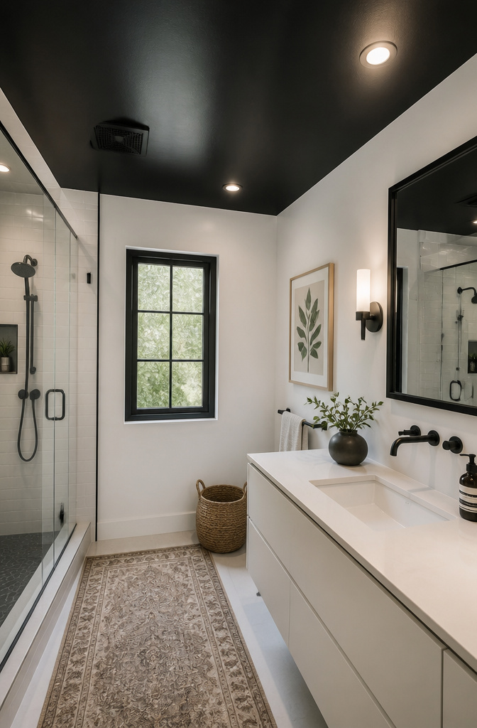
Black paint in a bathroom reads dramatic until it reads claustrophobic, and the line sits closer than most people guess. I learned that the hard way watching a friend paint her powder room in a flat black that swallowed the one window and turned every evening visit into a cave experience.
Ceilings are where black earns its keep in small spaces. A saturated ceiling paired with white walls draws the eye upward and keeps the walls from boxing you in. Benjamin Moore’s Fruit Shake 2088-60 or Windmill Wings 2067-60 on the ceiling beside black accents is one way to play it; the black itself stays on inset shelving or trim where it can act as punctuation rather than paragraph.
For any black that lives on a wall or door, the finish matters more than the color. Eggshell hides imperfections but holds moisture stains; satin or semi-gloss wipes clean and resists the steam that collects near showers and sinks. High-gloss black on trim or built-ins reads intentional and gallery-like, though it will show every brush mark and dust speck you hoped to hide. I would reserve that level of shine for areas you touch often enough to wipe down, and keep it away from broad wall surfaces unless you enjoy chasing lint with a microfiber cloth.
13. Plums
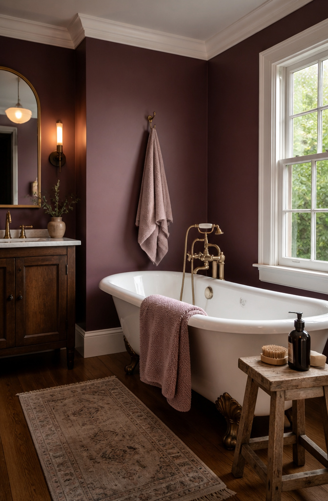
Plum reads heavier in a bathroom than it does on a swatch, because steam softens the edges and the color sinks into itself. What keeps it from feeling like a 2000s accent wall is the pairing. Brass or matte black fixtures pull it toward wine-bar moodiness; chrome sends it back to the era of sponge-painted borders. I would skip chrome entirely here.
The finish matters more than the hue. Aura Bath & Spa in a matte finish handles the humidity without the plastic shine older formulas needed, and that softness is what lets plum feel like a color choice rather than a rebellion. Satin or semi-gloss from other lines works too, but the lower sheen keeps the purple from performing too hard.
Trim is the place to pull back. Warm white woodwork, not cool gray, gives plum somewhere to land. Without that warmth, the color turns theatrical fast.
14. Timeless Whites
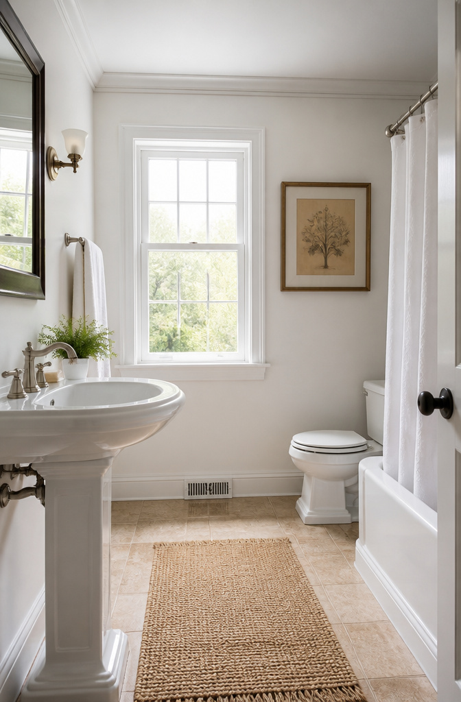
White walls in a bathroom live or die by the light you already have. North-facing baths turn most whites flat and gray, so a warm undertone saves the room from looking like a clinic. South or east light behaves better, but the glare off tile and porcelain can still feel harsh by 10 a.m. if you pick a white with too much blue.
Benjamin Moore’s Simply White (OC-117) sits near the middle of the warm-cool divide, which is why it keeps showing up in small bathrooms packed with towel racks and framed prints. It reads clean without fighting brass or black hardware, and it does not go pink against cool chrome the way cream whites can. The tradeoff is maintenance. Every water spot and scuff announces itself on white, especially at matte finish. Aura Bath & Spa in matte changes the math slightly; the mildew-resistant formula handles shower-zone humidity without the plastic sheen of old semi-gloss, but the surface still needs wiping more often than a mid-tone would.
Fixtures dictate the undertone more than the paint name does. Warm wood vanities and vintage brass pull toward yellow-based whites. Cool marble, chrome, or black metal want something closer to neutral, never creamy. Simply White works across both because its warmth is restrained, but test it at floor height where the tile bounces color upward. What reads crisp at eye level can turn buttery against limestone or green against gray porcelain.
Paint Finishes That Survive Steam
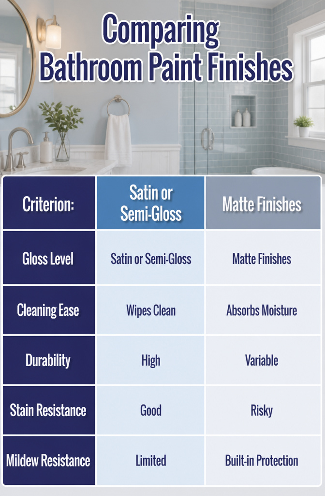
Satin and semi-gloss finishes earn their keep in bathrooms because they actually survive what happens in there. Steam condenses on walls. Toothpaste splatters. Someone inevitably touches the paint with wet hands. A finish with some gloss to it wipes clean without lifting the color, and the tighter surface film slows moisture from working into the substrate.
Matte finishes have started showing up in bathrooms, mostly through products like Benjamin Moore’s Aura Bath & Spa, which is marketed specifically for high-humidity rooms with a mildew-resistant coating. The appeal is obvious: bathrooms are hard surfaces everywhere, tile and mirror and chrome, and matte paint softens that. The risk is that standard flat or matte paint in a bathroom will absorb moisture, stain easily, and grow mildew in the film itself. If you want matte, buy the formulation built for it; don’t just use leftover ceiling paint because the color looked right.
How Light Lies to You
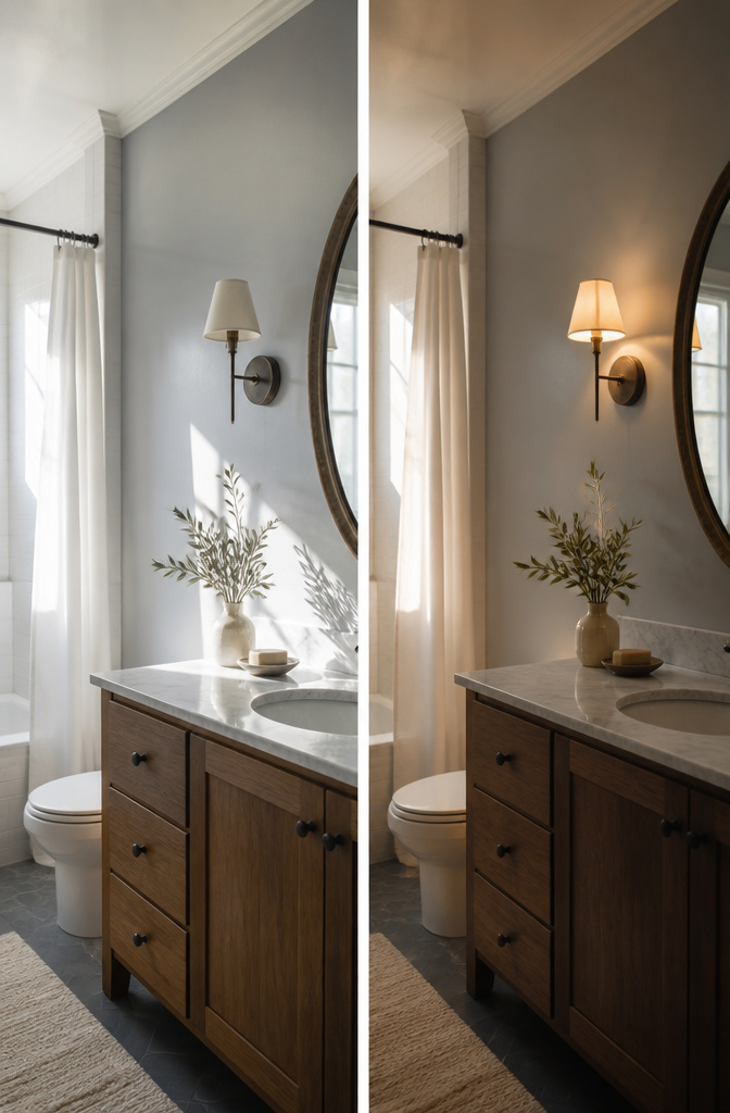
Natural light shifts a bathroom paint color from dawn to dusk, pulling out undertones you might not notice under the store’s fluorescent tubes. A soft gray that reads crisp at noon can turn muddy by evening lamp light, while warm bulbs soften bold hues into something more livable. That is why the sample boards matter more than the chip.
I learned to paint test patches on two walls, not one, and check them at the hours I actually use the room. The mirror is the trap: the light bouncing off your face changes how the wall behind it reads, and some colors will throw your skin tone off enough to complicate a morning routine. Cooler light temperatures open up a small space, but if your only window faces a brick wall, you are working with whatever the fixture gives you. Live with the sample for a full day before you commit to the gallon.
Making the Fixtures Match
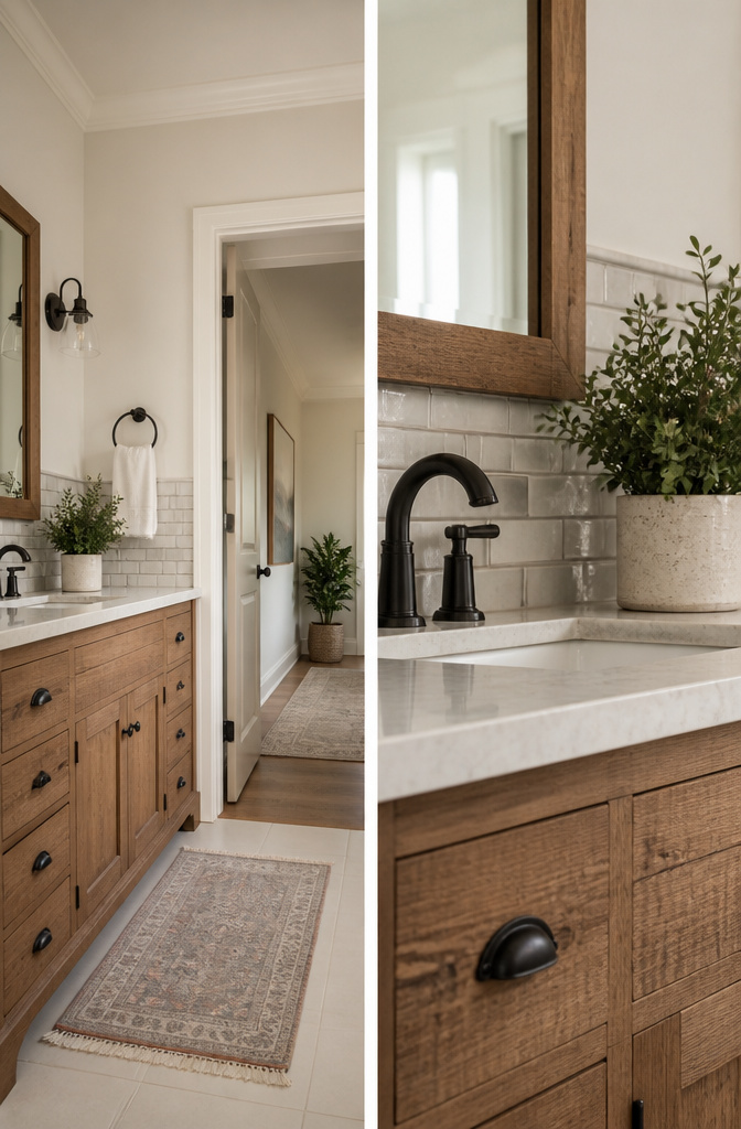
The fixtures in a bathroom usually outlast the paint by a decade or more, so the color you roll on has to live with what is already there. Tile, countertop, and hardware all carry undertones that can turn a pretty swatch sour once it covers four walls. A warm vanity under cool gray paint, for instance, reads as dirty; the same vanity with a warm white like Benjamin Moore’s Gardenia AF-10 settles in quietly. Match the undertone, not the color itself: the tile does not need to match the wall, but a subway tile with subtle gray notes will fight a paint with peach or yellow beneath it.
When replacing the vanity or faucet is not in the budget, the cheapest move is to treat the fixture as the anchor and build outward. A rustic wood vanity pulls toward cozy whites; sleek chrome or black hardware leans into cool neutrals like grays. If the fixtures are ornate or vintage-style, a deeper color can treat them as the jewelry in the room rather than the problem. The hallway outside matters too; a color flow from adjoining spaces keeps a small bathroom from feeling like an afterthought. Benjamin Moore pairs Gettysburg Gray HC-107 with Sail Cloth OC-142 for this reason, letting the bathroom relate to the rest of the house without copying it exactly.
Frequently Asked Questions
What are some popular bathroom paint colors?
Soft blues, greens, off-whites, and warm beiges lead the list. Benjamin Moore’s Chantilly Lace OC-65 and Ballet White OC-9 are standouts among off-whites, while greens and blues rate high as full schemes rather than single accents.
How can I make a small bathroom look bigger using paint color?
Lighter colors like soft blues and off-whites open up the space by reflecting more light. Painting the ceiling a different color, such as a saturated shade against white walls, draws the eye upward and keeps the walls from boxing you in.
What type of paint finish is best for bathrooms?
Satin and semi-gloss finishes are the practical choices for moisture resistance and washability. Satin hides wall imperfections and handles steam well; semi-gloss reflects more light and wipes down easier near sinks. Both resist moisture better than flatter sheens.